Novel Illustration
Final Drafts (10x8)
Rough Drafts
|
Tools:
Shape Tools Move Tools Photoshop Layers for Textures Ruler Eyedropper Path - Object - Divide |
Concept:
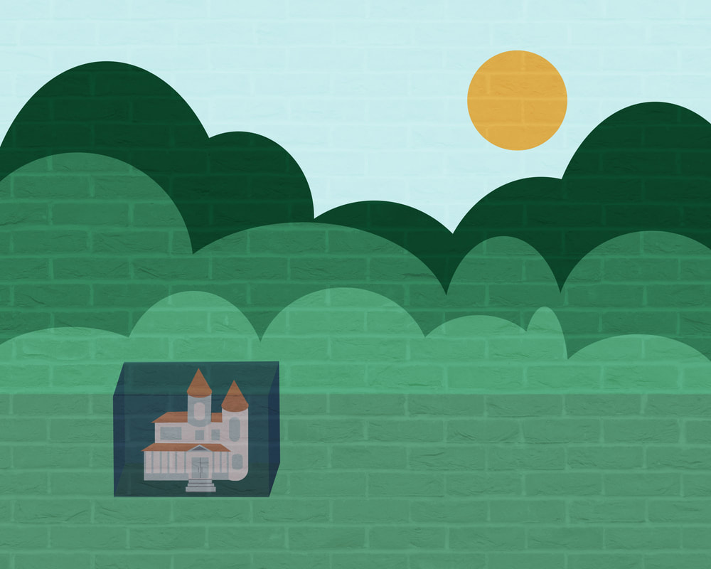
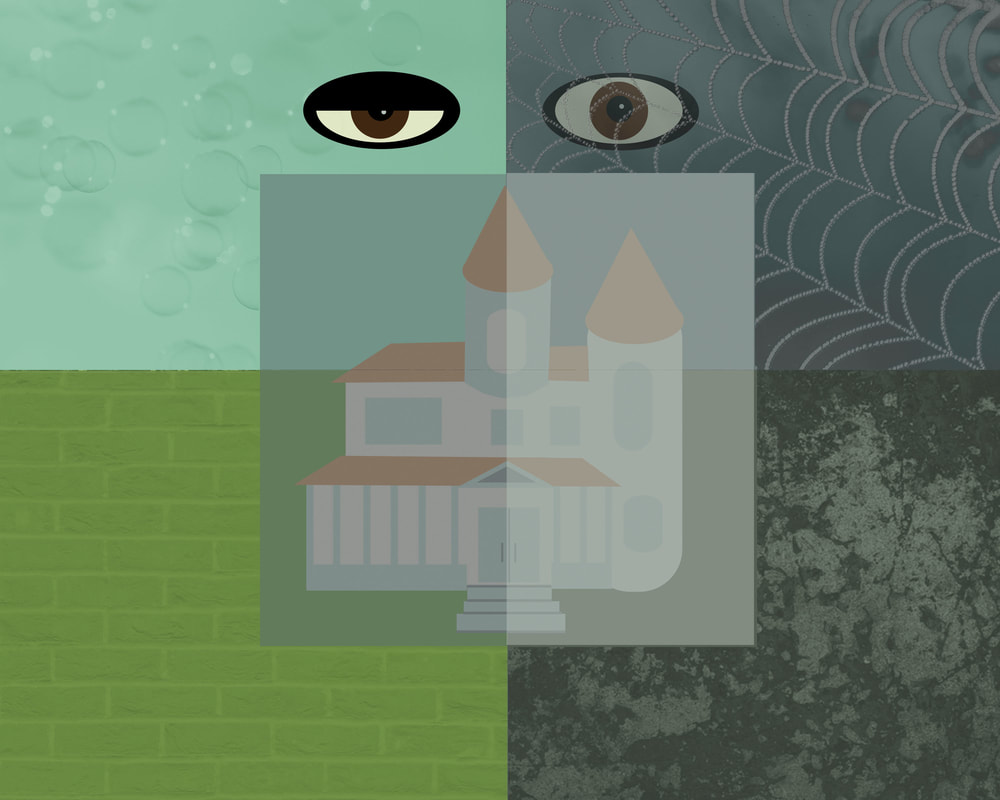
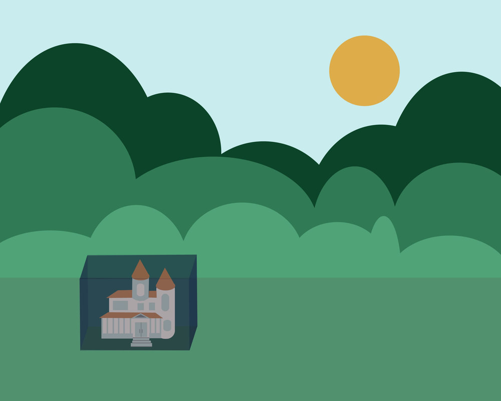
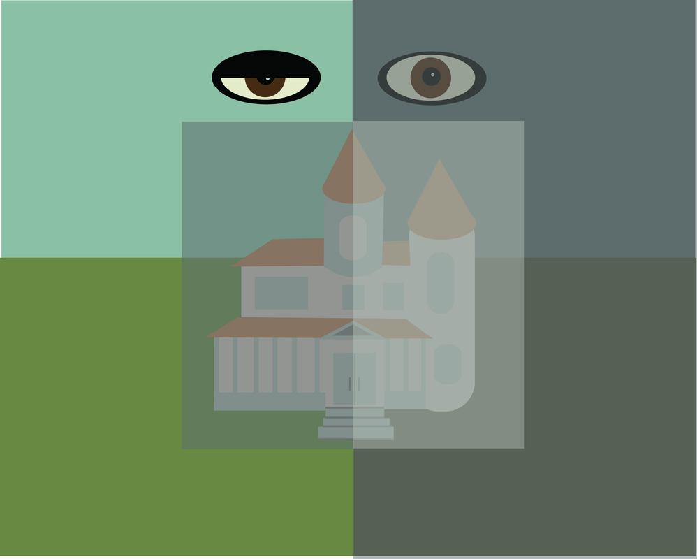
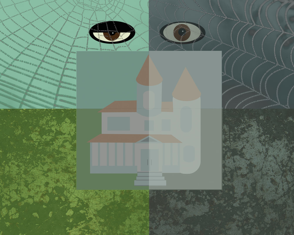
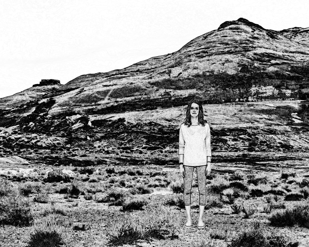
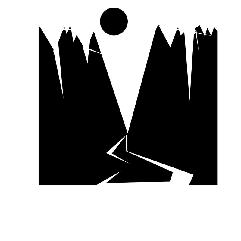
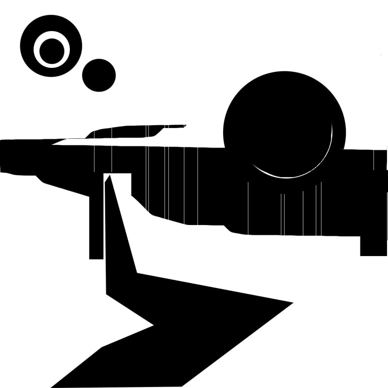
I was tasked with designing an illustration for a novel based off of a passage. I chose a passage by Shirley Jackson in The Haunting of Hill House. THE HAUNTING OF HILL HOUSE (SHIRLEY JACKSON) No live organism can continue for long to exist sanely under conditions of absolute reality; even larks and katydids are supposed, by some, to dream. Hill House, not sane, stood by itself against its hills, holding darkness within; it had stood so for eighty years and might stand for eighty more. Within, walls continued upright, bricks met neatly, floors were firm, and doors were sensibly shut; silence lay steadily against the wood and stone of Hill House, and whatever walked there, walked alone… In my first illustration, I really wanted to illustrate the loneliness of the house among the hills. It remains alone beside the hills, holding its darkness within. I created a visual box of dark colors to symbolize the darkness that flows within and around it. I used the brick texture due to its mention in the quotation. In my second illustration, I wanted to depict the dream state of the house. I wanted to design an image that showed the dark dream side of the house as well as its outside. The contrast between the two is shown by the colors and textures. |
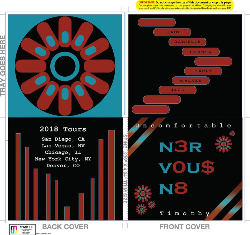
Rock Band Digipack Designs
Finished Rock Band Mock-Ups
Draft of Different Colors
|
Tools:
Shape Tools Text Tool Pen Tool Gradient Transform |
Concept:
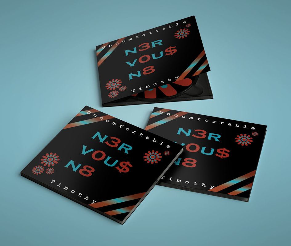
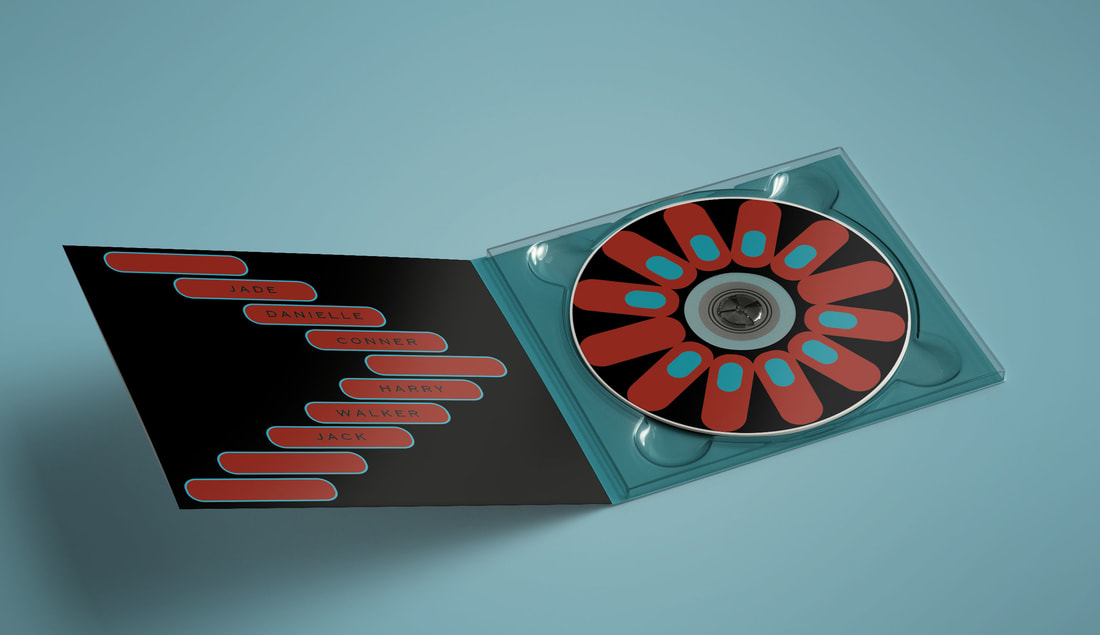
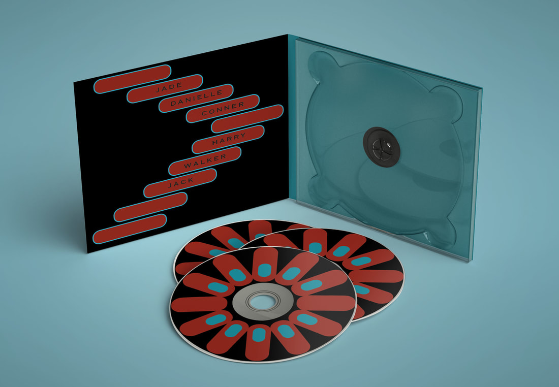
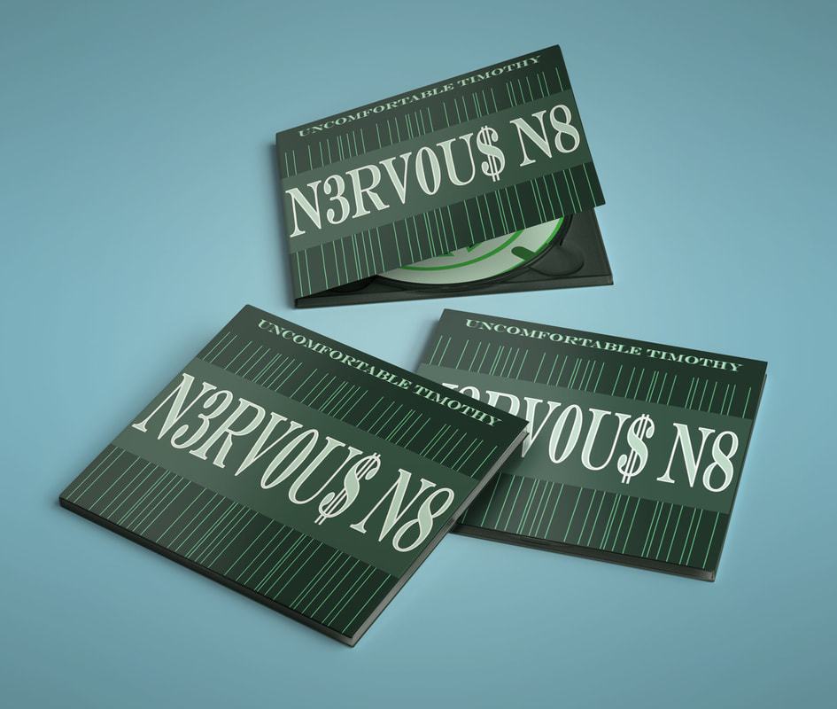
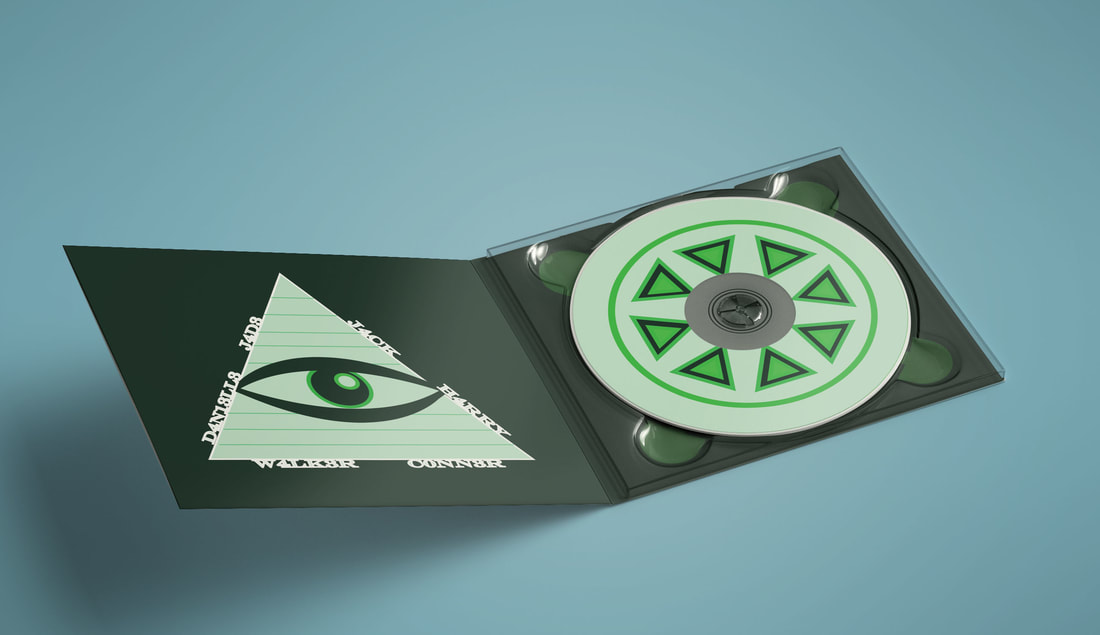
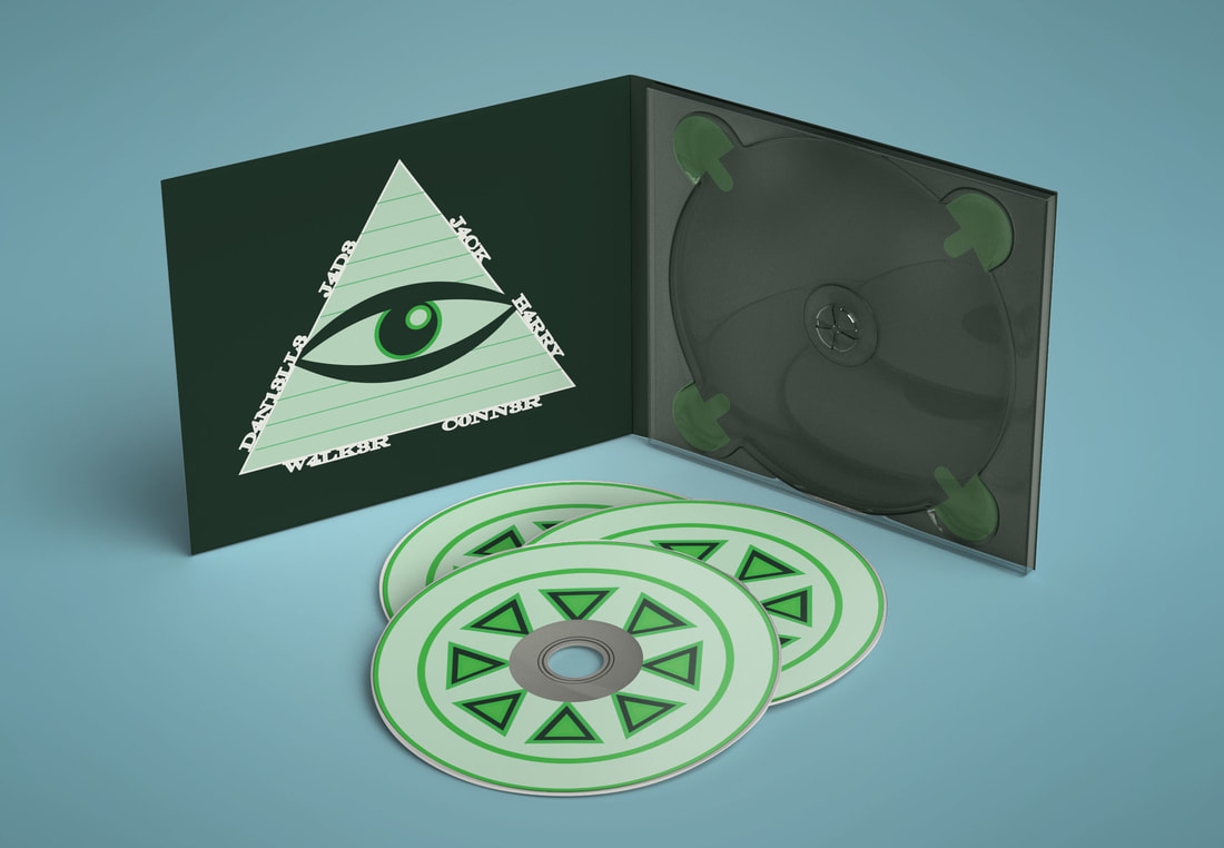
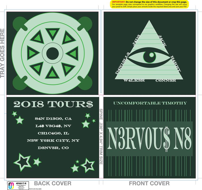
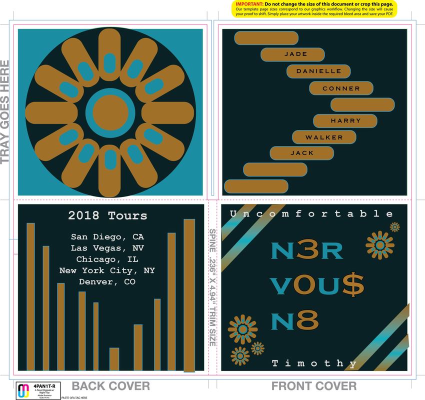
We were tasked with creating digipack designs for bands in the Rock Band class. I was given the band Uncomfortable Timothy and I had to create an album design for their new album, "n3rv0u$ n8". I created the entire layout in Illustrator within the flat four square design. I then saved them as 4 separate illustrator files so that I could open them in Photoshop and adjust them to fit in the mock ups we were given. My first design started out as a combination of orange/blue/gold colors. This didn't feel edgy enough for pop/rock band so I changed the colors to red/black/blue which really improved the outcome of the digipack. I went with simple shape designs on most of the covers, except for the front which has a lot going on. I included a mandala design, gradient stripes, shapes with outlines, and of course different fonts in my overall design. I really like the inside designs on this digipack, with the names inside rounded rectangles as well as the mandala design as the cd art. My second design just started out with green colors, and I went with this illuminati theme. It is less edgy than my first design, but I wanted to design something with a different vibe. I also changed a lot of the letters to be numbers/symbols such as the band did with their album name, "n3rv0u$ n8". I think the cover design was my favorite for the green digipack design, even though it is very simple, I really like how the different shades of green work together. Also, I enjoy the design of the font that is tall and skinny on the front. |
Vector Portraits
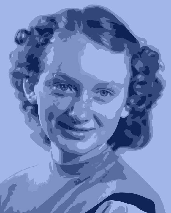
Grandmother, Nina G. (8x10)
|
Tools:
Pen Tool Arrange (CTRL + [ ) Send to Back (CRTL + SHIFT + [ ) Rectangle Tool |
Concept:
In order to create the image that we could make into a vector, we had to start in Photoshop first. I loaded my image into Photoshop, made several layers, and altered the photo in different ways. My first photo of my grandma was originally black and white, so I made a color layer that was set on "Color" mode to create a blue portrait. Then, while selecting the actual image layer, I went to IMAGE - ADJUSTMENTS - POSTERIZE. I used a posterize level of about 7 I believe. This made the photo pixelated and easier to see the different color blocks. I saved this JPG and loaded it into Adobe Illustrator where I began to use the pen tool to outline the shapes of color on the portrait image. I started with the highlights and small shadows so that those shapes were on top. I then went back and made the bigger shapes, like the big color blocks of the skin and hair. |
Alternative Movie Posters
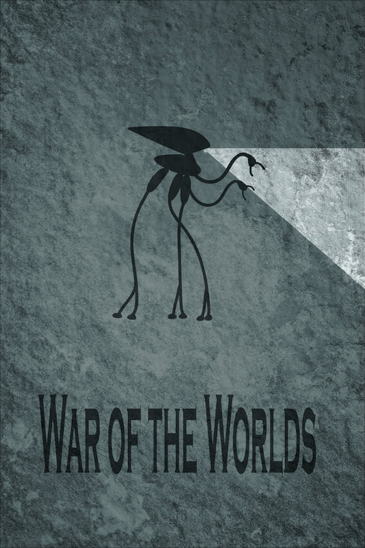
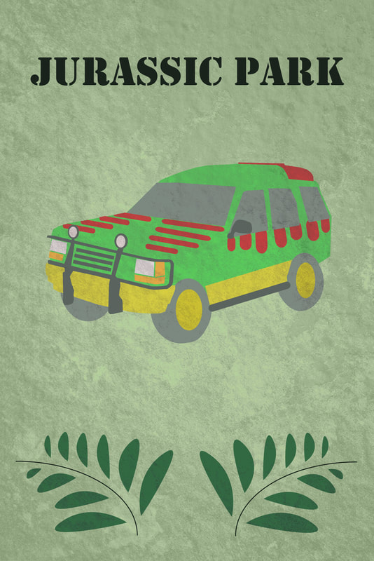
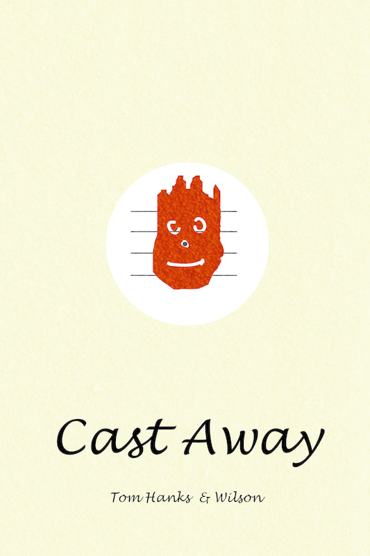
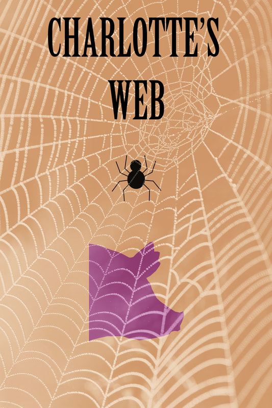
War of the Worlds, Jurassic Park, Cast Away, Charlotte's Web (all 6x9)
|
Tools:
Blob Brush Tool (SHIFT + B) Pen Tool Eraser (SHIFT + E) Type Tool Move Tool Shape Tools Line Tool Arc Tool Photoshop: Overlay and Darken blending modes Transform Tool Desaturate (CTRL + SHIFT + U) |
Concept:
We were tasked to created alternative movie posters, making traditional posters either very minimalist and simple or super detailed. The pen tool was probably the most useful tool in this assignment. For my Jurassic Park poster, I created the car almost entirely out of vector shapes created by the pen tool. For the War of the Worlds Poster, the blob brush was very useful for creating the long arms and legs of the tripod. For all three, textures were very important to the finished piece. The flat color of the original posters is nice and clean, but the texture makes them more dramatic and interesting. Fonts also played a large role in creating the mood of the final poster, all three fonts I chose are very unique to the movie. They contribute to the overall presentation of each poster. PRINT = 300 ppi, CMYK WEB DISPLAY = 72 ppi, RGB Traditional Movie Posters are 24" by 36" |
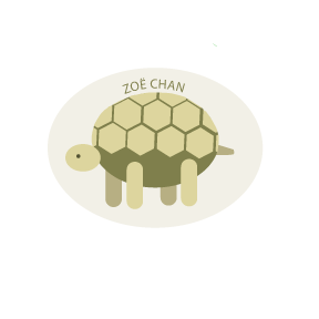
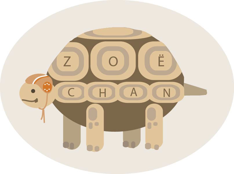
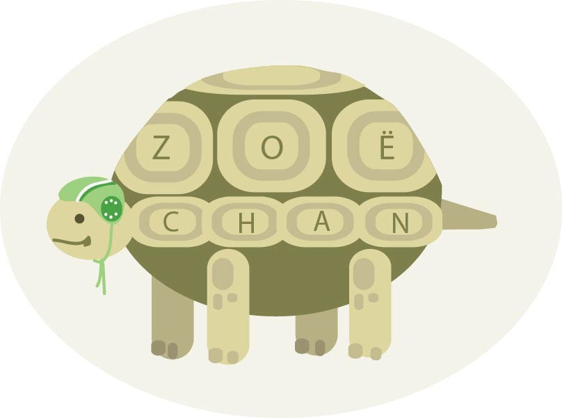
Logo Design
Final Draft
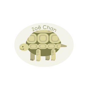
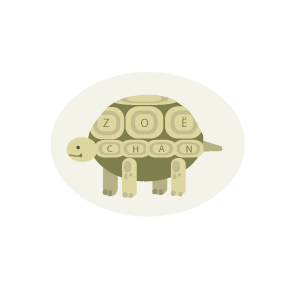
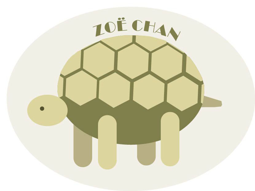
Variations of Final Logo Choice

Initial Compositions (6)
Logo Small Sketches (12)
|
Tools:
Move Tool (V) Shape Tools Eyedropper Tool (I) Rotate Tool (R) Type Tool (T) Type on a Path Tool |
Concept:
We were paired with random partners in the class to design a logo for a client. We interviewed each other to help develop logo ideas for the other person. I started by drawing 12 thumbnail sketches on paper to draft the logo. Then I created 6 compositions of possible logos for my "client", with one being in black and white. My client decided to choose the tortoise logo, so I continued to develop a few more final drafts and make some changes before she selected a final draft. |
Mandalas
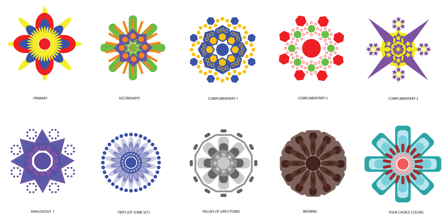
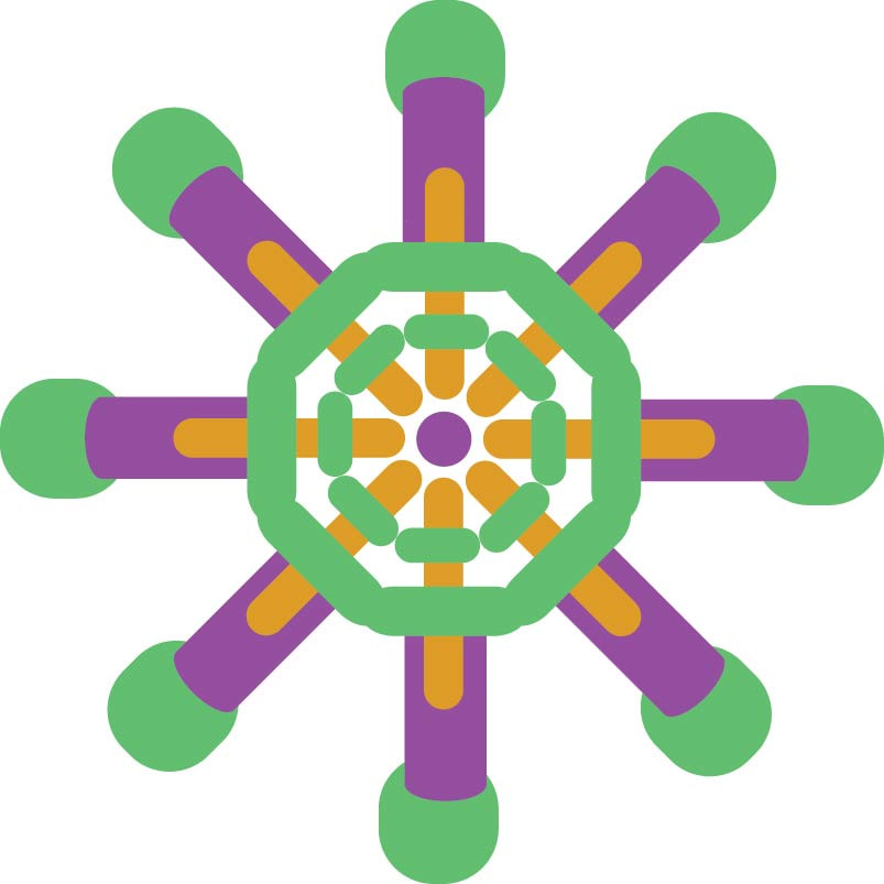
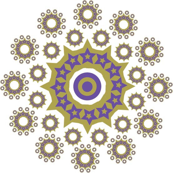
I redid the Secondarys and Complimentary 3 mandala, the old ones weren't my favorites.
|
Tools:
All of the Shape Tools Rotate Tool (R) Move Tool (V) Duplicate (CTRL + D) Horizontal Align Center Group (CTRL + G) |
Concept:
To create the mandala, I started with a circle in the center. Then, I proceeded to put a shape above the circle, making sure it is aligned with the center circle. I then select both of the shapes (SHIFT + Move Tool) and activate the Rotate Tool (R). I clicked the center of the circle while holding down the ALT key to get a pop-up menu that allows you to change the degrees of rotation around the circle. You must select a number of degrees that will divide evenly into a circle in order for the shape to duplicate evenly all the way around. After that, I select "Copy" to copy the shape the amount of degrees over that I indicated. CTRL + D will duplicate that shape over and over again around the circle. At the end, you have to delete the extra circles in the center that duplicated along with your shape. Then I can group the same shapes together so they are easier to manipulate and change colors. I repeated this process for each of the different shapes in the mandala. |
Vector Landscapes
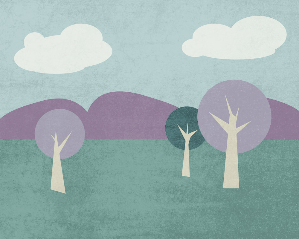
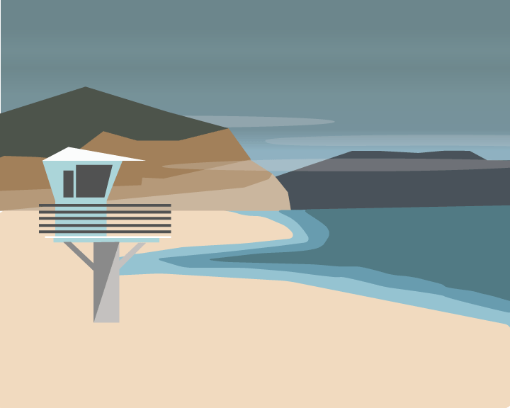
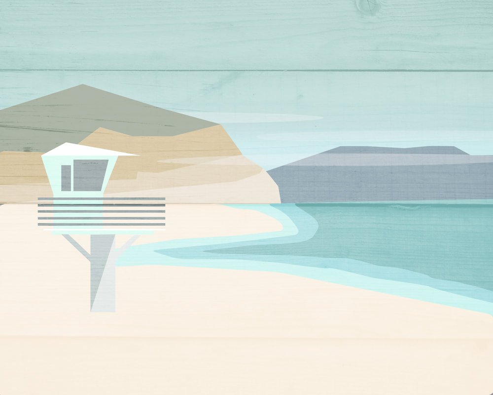
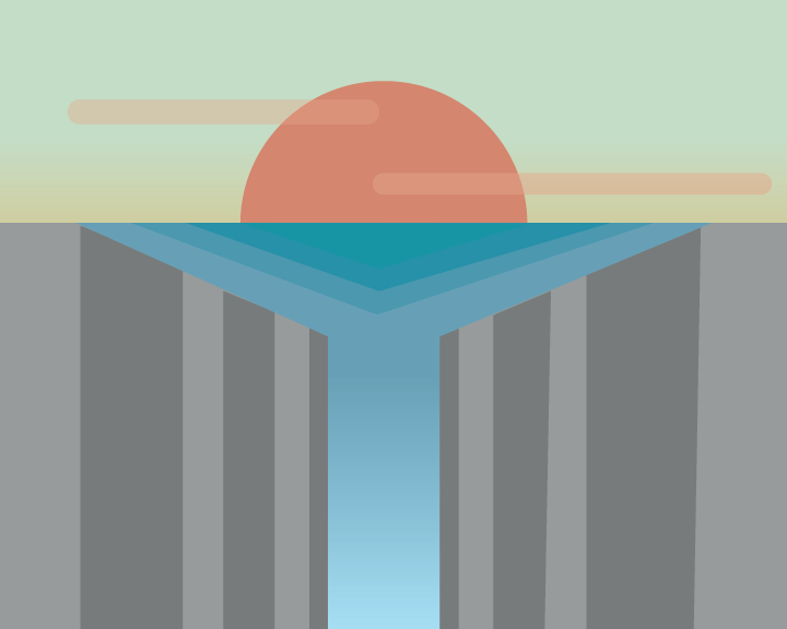
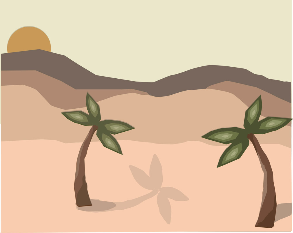
Vector Tutorial, Vector Tutorial with Gradients, Beachscape Vector Landscape, Beachscape with Texture, Waterfall
|
Tools:
Pen Tool Shape Tools Move Tool |
Concept:
This is my first time using Adobe Illustrator with vectors. We began by creating simple shapes with the Pen Tool and Shape Tools to create a landscape based off of vector objects. I completed two tutorials that taught the basics of manipulating shapes and using color to create the landscape. I also learned how to put a texture behind the flat color, vector landscape in Photoshop afterwards. Using OVERLAY or SOFT LIGHT layer types works best after desaturating the textured photo. I did this with the beach landscape I created in a second picture, using a background of wood grain to make it less flat. I also worked with gradient colors to add more interest to the landscapes instead of just leaving everything in one flat color. |
Fantastical Portraits
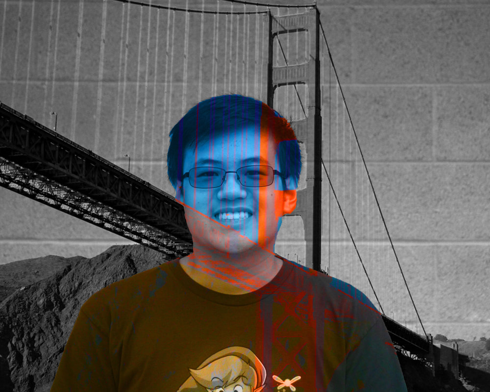
Some images were used from Creative Commons Images.
|
Tools:
All of them |
Concept:
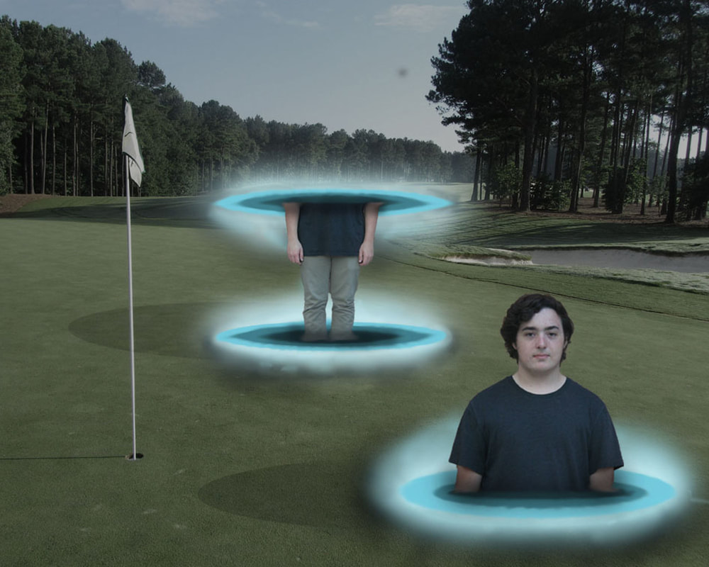
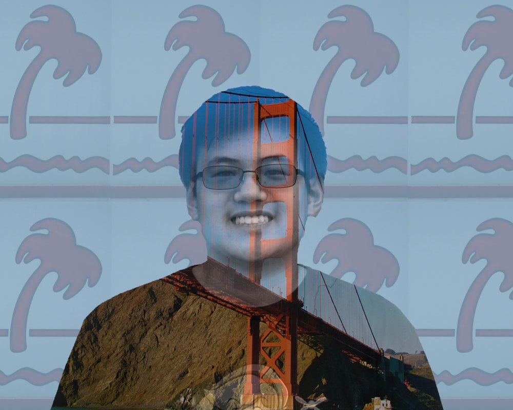
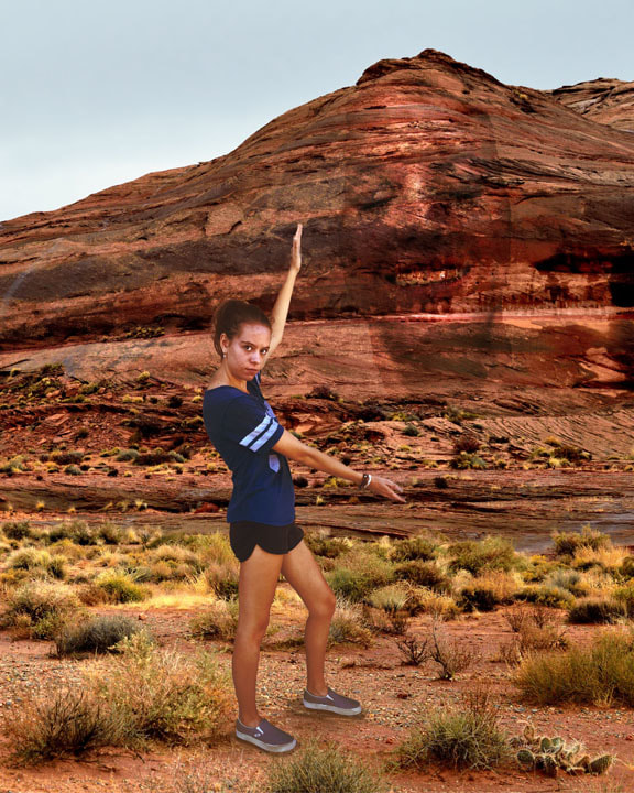
I used several different techniques and Photoshop tutorials to create these portraits. I used a double exposure technique for a few of them. I had to create multiple portraits to figure out what looked the best and how to best represent each person through images. Matthew - San Francisco, Burgers, Teal & Red Max - Golf, Teleportation Hannah - Arizona |
Watermark - Custom Brush

Pencil Drawing Effect
|
Tools:
Guassian Blur Invert Colors (CTRL + I) Desaturate (CTRL + SHIFT + U) New Layer (CTRL + J) Layer Mask Adjustment Layer (B&W) Filter Gallery - Glowing Edges, Charcoal Layer Modes - Multiply, Color Dodge |
Concept:
This effect requires duplicating the first layer several times and manipulating each one to create a pencil drawing effect. The first copy layer uses a B&W adjustment layer, then inverted colors, and finally uses Guassian Blur to bring back the outline. That layer is on the mode of Color Dodge. A second copy of the original photo is made to be desaturated, and then put on Glowing Edges from the Filter Gallery with adjustments made there. When back on the layer in Photoshop, the colors are inverted to make that outlined border. Finally, that layer goes on the mode of Multiply. A third copy of the photo is made and is desaturated again, Filter Gallery -> Charcoal to make adjustments. This layer is put on the same mode of Multiply. When I went back to add more images, I really tried to focus on bringing some of the detail back into the pencil sketch from the original photos. I went back with layer masks on each duplicated layer to bring back detail and shading in certain areas. I also tried to smooth out stray lines and "pencil marks". |
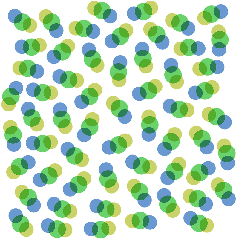
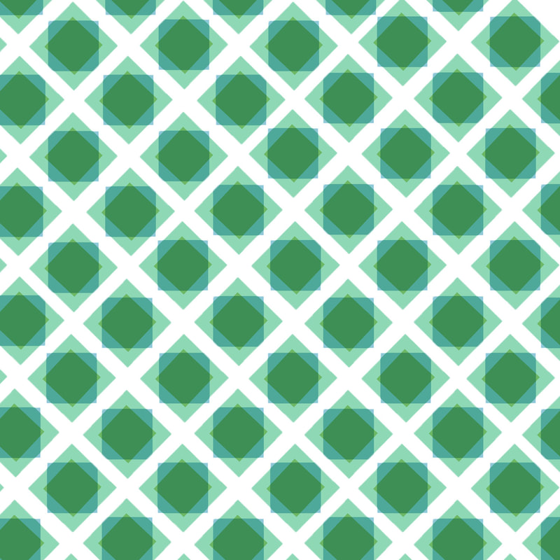
Displacement Product Mock Up & Patterns
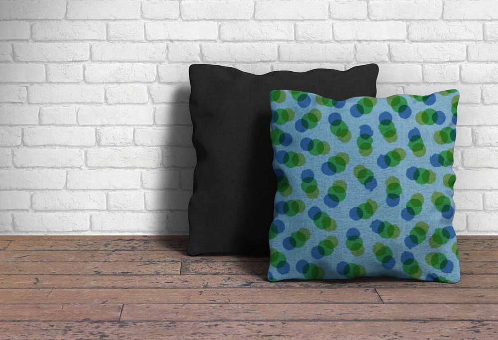
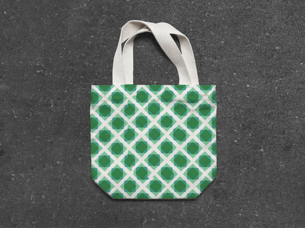
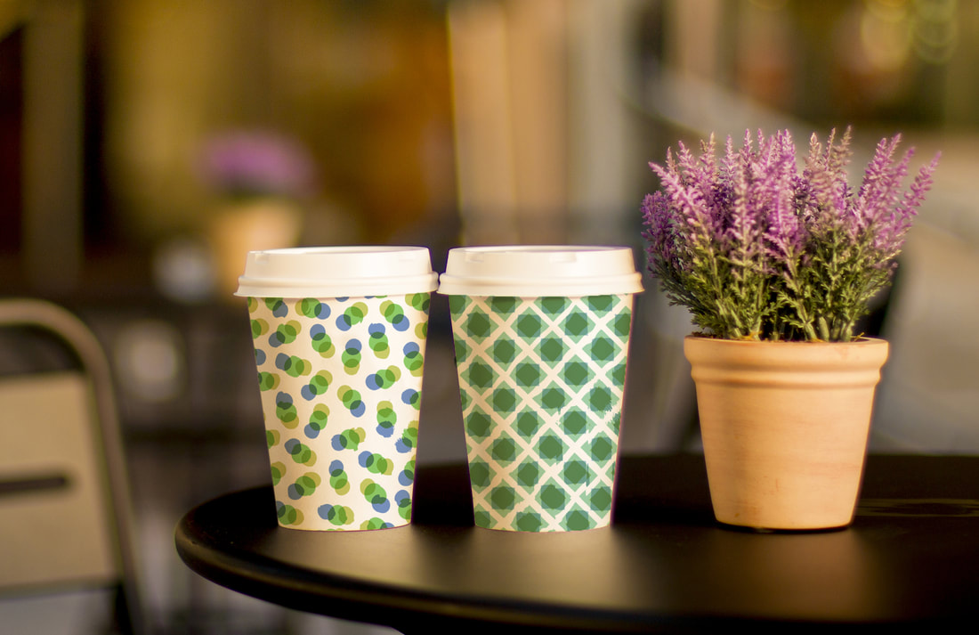
Pillow, Tote Bag, Coffee Cups
2 Patterns I created with Photoshop
2 Patterns I created with Photoshop
These base pictures come from the site www.mockupworld.co
|
Tools:
Displace/Distort Filter Layer Mask Marquee Tool Paint Bucket Tool Brush Tool Levels, Black & White Adjustments Magnetic Lasso Tool Quick Select |
Concept:
I first created my pattern using the marquee tool to create some interesting shapes that I could repeat on a background using ALT + click. Then, I selected the area of the picture that I wanted to put the pattern on, copied and pasted, and made it black and white to better distort the pattern. Then on the pattern layer with the black & white layer of the object selected with CTRL + click, I used the filter displace and distort. I usually used a level of around 3-10 for the horizontal/vertical scale with the objects, otherwise the pattern came out looking jagged and unrealistic on the object. Then a layer mask was created to limit the pattern to a certain area and I used the mode "Multiply" for the mask to add texture and shadows back to the images. It was fun to create a pattern by just repeating a certain design over and over again. I'm happy with how the coffee cups came out with the pattern because earlier I had tried to put a pattern over a coffee mug, which looked fake and very flat. On the coffee cups, I was able to keep the shadows on the cup to go over the pattern to keep the lighting very realistic. |
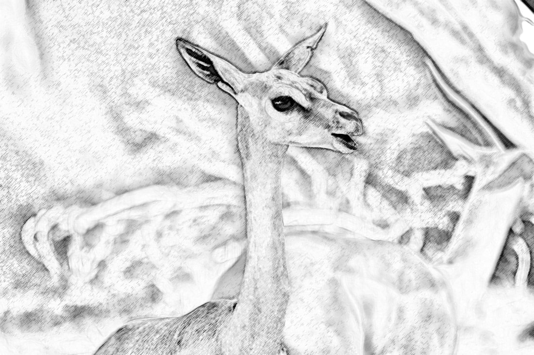
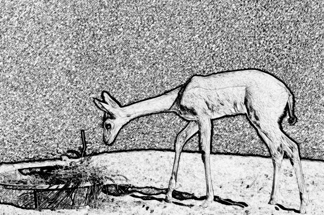
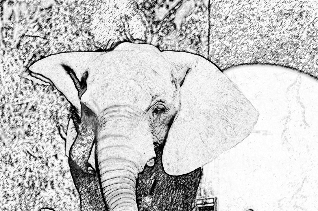
Tri-Animal Hybrid
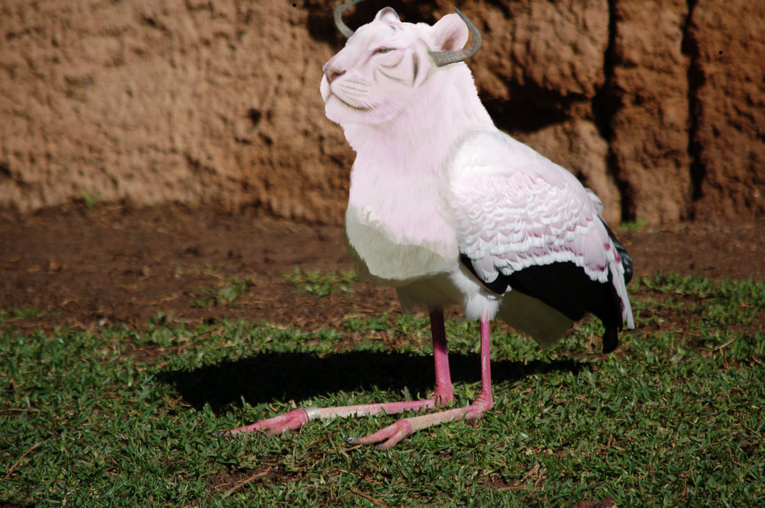
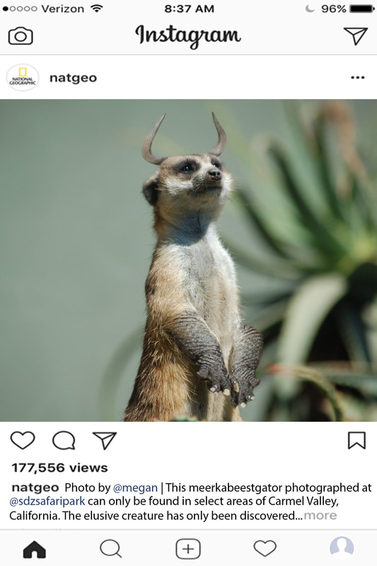
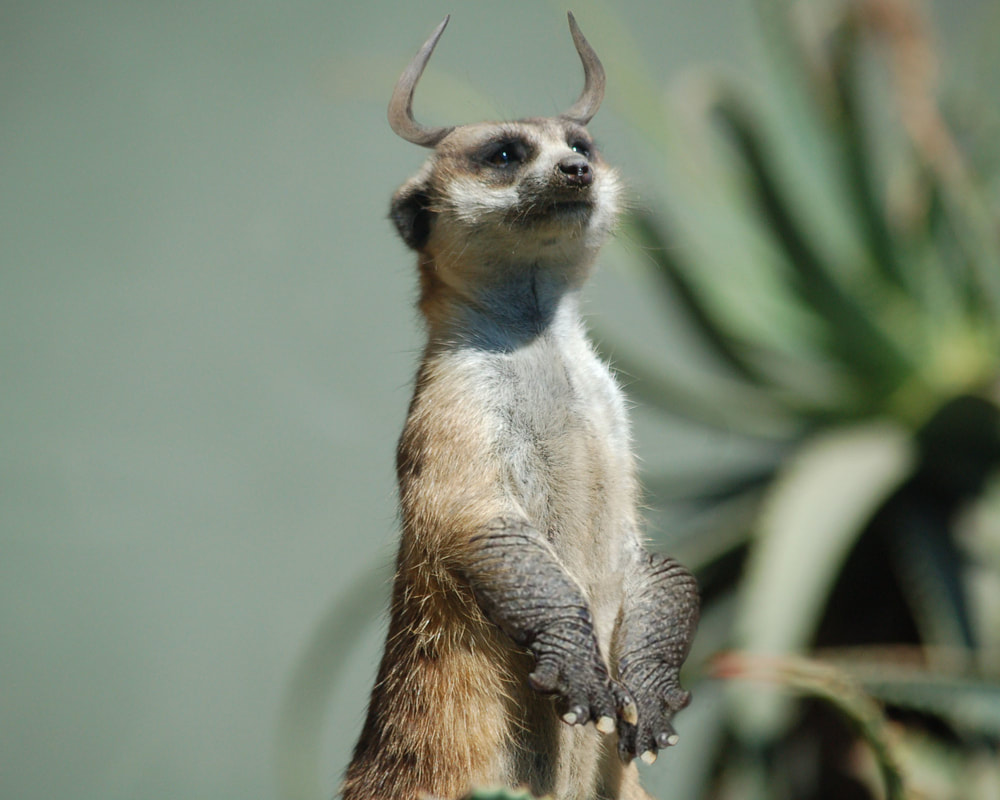
Tigork (practice/uncompleted), 6x9 Gerenukatah, 9x6 Instagram Post, 8x10 Photo of Meerkabeestgator
Animal pictures used are mine.
|
Tools:
Clone Stamp Brush Tool Layer Masks Transform Move Tool Blur Tool |
Concept:
I had to combine three different animals to create a tri-animal hybrid. I chose pictures of a meerkat, alligator, and a wildebeest to create the meerkabeestgator. Layer masks made it easy to select one part of each animal and I transformed the layer masks to put them in the correct positions. I also used the brush tool on low opacity and flow while selecting the layer mask to lightly blend the fur from the meerkat onto the arms of the alligator. Finally, I used the clone stamp to erase some of the meerkat's original claws which were not covered by the alligator arms. The wildebeest horns were easier to attach, as there wasn't as much blending involved. I did add shadows to both the alligator arms and horns to make them look more realistic in the original lighting of the meerkat. I also blurred the edges of the horns to make them less sharp and more faded to look realistic. When I was working on the gerenukatah, I think obtaining photos with similar lighting was essential to creating such a realistic effect. The head of the gerenuk and the meerkat were both super light against very dark backgrounds which made blending the two much easier. The shadows match and therefore creates a more realistic picture. I added the cheetah tail on and used 20% opacity on the black brush to create shadows underneath the tail to mimic the other shadows in the photo. Meerkabeestgator = meerkat, wildebeest, alligator Gerenukatah = gerenuk, meerkat, cheetah Tigork = tiger, stork |
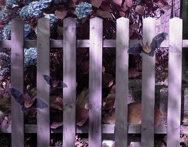
Fix the Fence
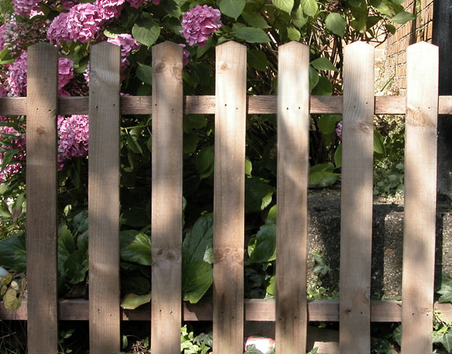
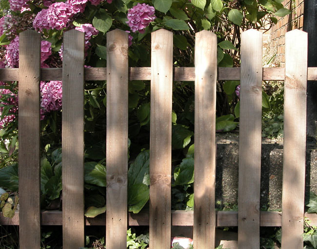
Broken Fence, Fixed Fence, Fantastical Fence (Retro Fence),
Other Fixed Fence, Fantastical Fence (Creepy Fence)
Other Fixed Fence, Fantastical Fence (Creepy Fence)
|
Tools:
Lasso Tool Layer Mask Blur Tool Cloning Stamp Brush Tool Move Tool |
Concept:
I first fixed the fence using the lasso tool to copy/paste one of the other posts on to the empty area. I proceeded to fix the edges, clone shadows, and move nail holes to make it unique. Then I used layer masks to make a retro-patterned fence that still had the texture of the original fence. I fixed the fence again using the clone stamp and lasso tool mainly. Then I changed the color balance and saturation of the fence to make it have this purple vibe. I added some extra creepy bats and a rat using a layer mask to put the rat behind the fence. Then I added an "outer glow" on the animals to add to the creepy mood. |
Shape Compositions
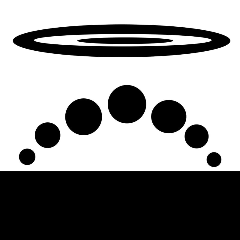
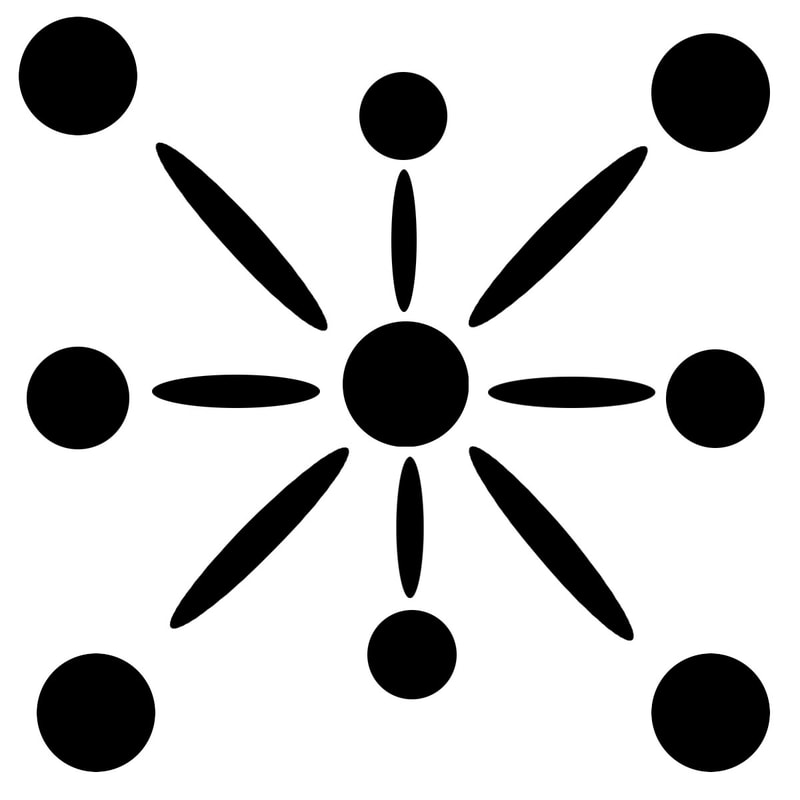
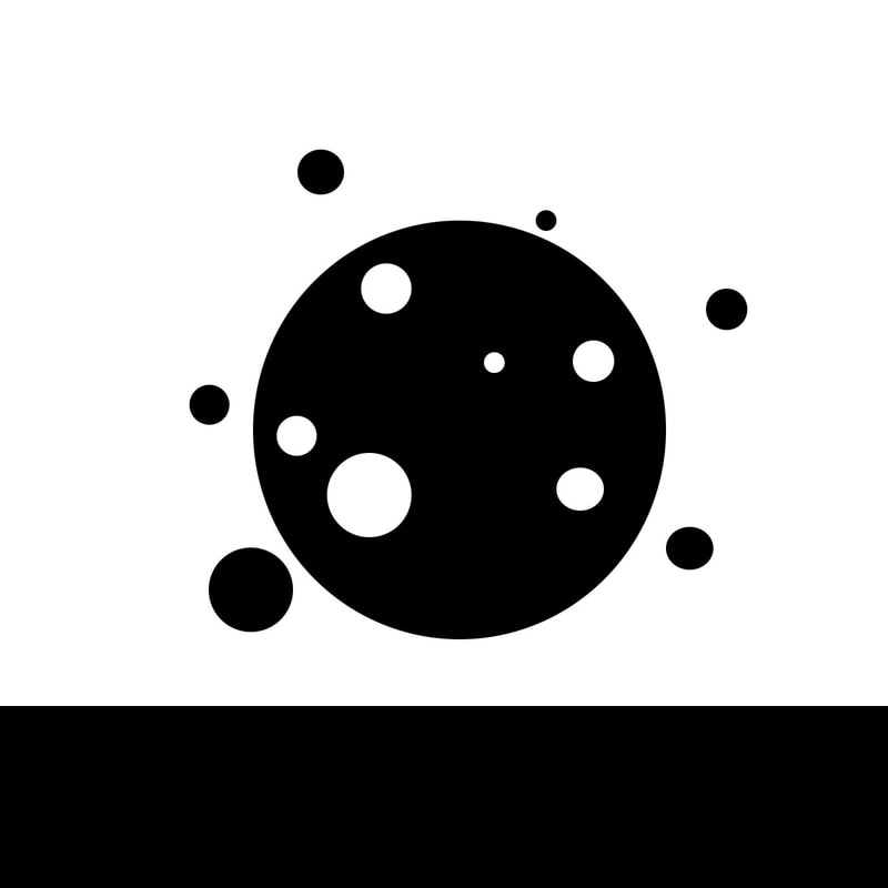
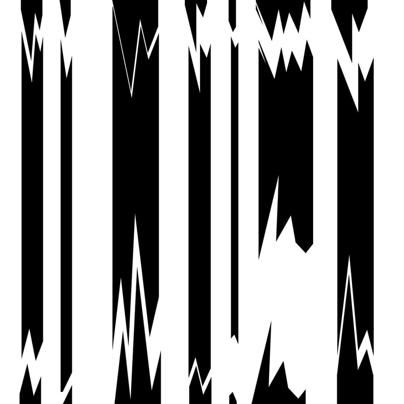
Top Left - Passive, Top Middle Left - Passive, Top Middle Right - Passive, Top Right - Active,
Bottom Left - Mysterious, Bottom Middle Left - Mysterious,
Bottom Middle Right - Active
Bottom Left - Mysterious, Bottom Middle Left - Mysterious,
Bottom Middle Right - Active
|
Tools:
Polygonal Lasso Tool Brush Tool Paint Bucket Tool Marquee Tool Move Tool |
Concept:
I worked with basic shapes to create images that would evoke the feelings of passive, mysterious, and active. Towards the end, I really worked to create images with less negative space and less of a square/hard-edge frame. My favorite would have to be the bottom right image. This image was created by using the magnetic lasso tool to just create some random pieces of black. I really love the composition because it covers a lot of the square and is very abstract overall. |
